Brand & Style
The design system is built on the principles of speed, precision, and utilitarian clarity. It targets a pragmatic audience that requires immediate feedback and zero friction when interacting with physical-to-digital bridge technology.
The aesthetic is High-Contrast Modern, emphasizing a clear distinction between the "active" capture state and the "static" data state. The UI evokes a sense of technical reliability through sharp contrasts and a focused visual hierarchy, ensuring that the primary function—scanning—remains the undisputed hero of the experience.
Colors
The palette is divided by functional context. The Primary Emerald Green is reserved exclusively for active scanning states, success confirmations, and the main call-to-action.
The Deep Slate serves as the immersive foundation for the camera interface, minimizing light pollution and focusing the user's eye on the viewfinder. When the user transitions to content or history views, the system shifts to a Light Gray and White environment to maximize readability and provide a clean, document-like feel for processed information.
Typography
This design system utilizes Inter for its exceptional legibility at small sizes and its neutral, systematic appearance.
Headlines use tighter letter spacing and heavier weights to command attention during the result phase. Label styles are frequently used in uppercase for metadata (e.g., "DATE SCANNED" or "FORMAT") to distinguish system-generated labels from the scanned data itself. The "code-display" style is optimized for long URLs or alphanumeric strings often found in QR payloads.
Layout & Spacing
The layout follows a fluid grid model optimized for mobile devices. A standard 16px side margin is applied to all content views.
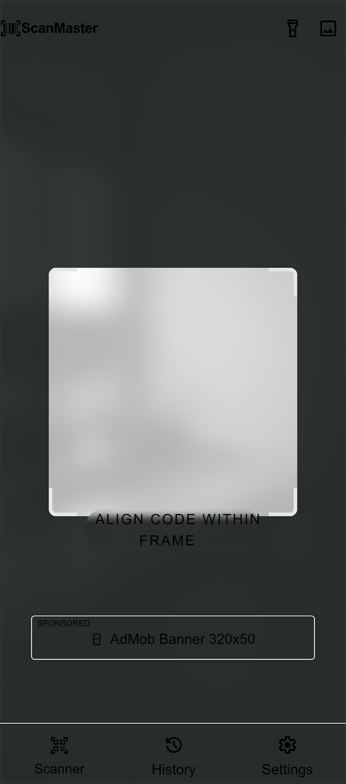
In the scanner interface, spacing is used to create a "frame within a frame." The viewfinder is centered with a 40px inset from the screen edges, creating a clear focus area. Content cards use a 12px internal gutter for tight, information-dense layouts, while external margins between cards are kept at 16px to maintain clear separation.
Elevation & Depth
Depth is communicated through Tonal Layering rather than traditional shadows.
- Scanner Level (Base): The deepest layer, using the Deep Slate background.
- Viewfinder Level: Created using a semi-transparent black overlay (60% opacity) surrounding the clear "cut-out" capture area.
- Result Cards: These use a clean white surface with a subtle 1px border (#E2E8F0) and no shadow to maintain a "flat-utility" feel.
- Action Sheets: High-priority modals utilize a soft ambient shadow (0px 10px 25px rgba(0,0,0,0.1)) to pull focus during the final interaction step.
Shapes
The design system employs a Rounded (Level 2) shape language.
Standard buttons and cards use an 8px radius. The primary camera viewfinder corners use a more pronounced 1.5rem (24px) radius to create a friendly "target" feel that contrasts with the square nature of QR codes. Ad banner slots and utility chips use a full pill-shape (rounded-full) to distinguish them from actionable content cards.
Components
Camera Viewframe
The frame consists of four "corner brackets" rendered in the Primary Emerald Green. These brackets should pulse subtly when a code is detected. The surrounding screen area is masked with a Deep Slate semi-transparent overlay.
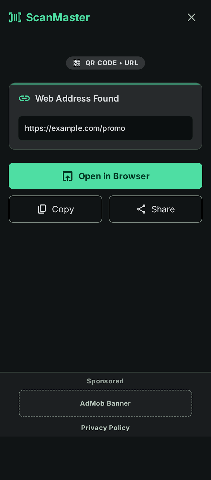
Scan Result Cards
These cards feature a white background with a top-aligned Emerald Green icon indicating the data type (e.g., Link, Text, Wi-Fi). Primary actions within the card (like "Open URL") use filled Emerald Green buttons, while secondary actions (like "Copy") use ghost buttons with Slate outlines.
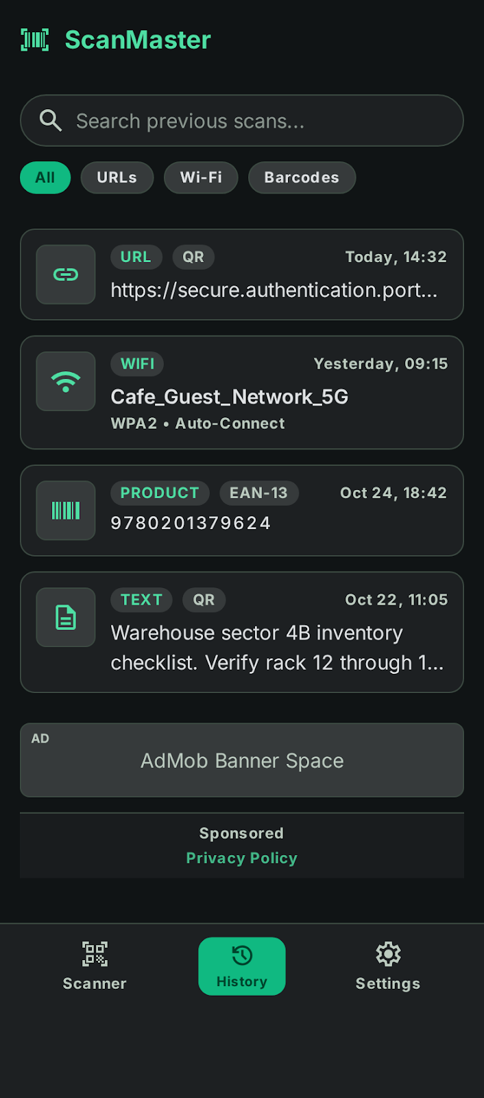
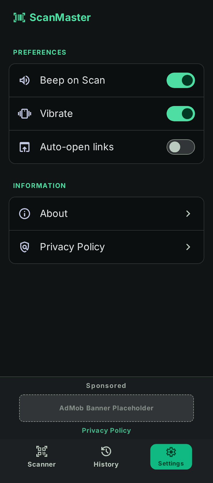
Integrated Ad Banners
Ad slots are positioned at the bottom of the screen, separated from the main content by a subtle Slate-100 divider. They feature a "Sponsored" label in the label-caps typography style. The background of the ad slot is a very light gray (#F1F5F9) to distinguish it from organic app content.
Primary buttons are high-contrast: White text on an Emerald Green background. They are full-width in result views to ensure easy thumb-reach.
Utility Chips
Small, rounded-full indicators used to show the "Scan History" count or the "Format" (e.g., "EAN-13") of a scanned code. These use Slate-700 backgrounds with White text for high visibility against the dark scanner interface.