Brand & Style
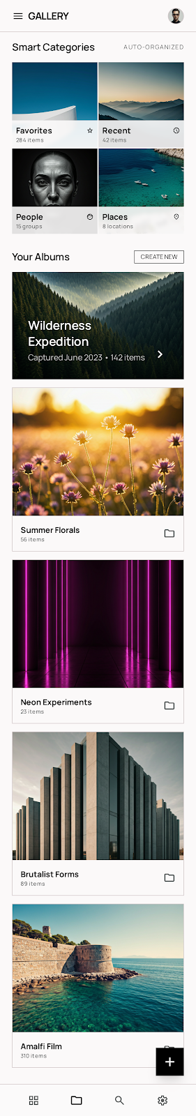
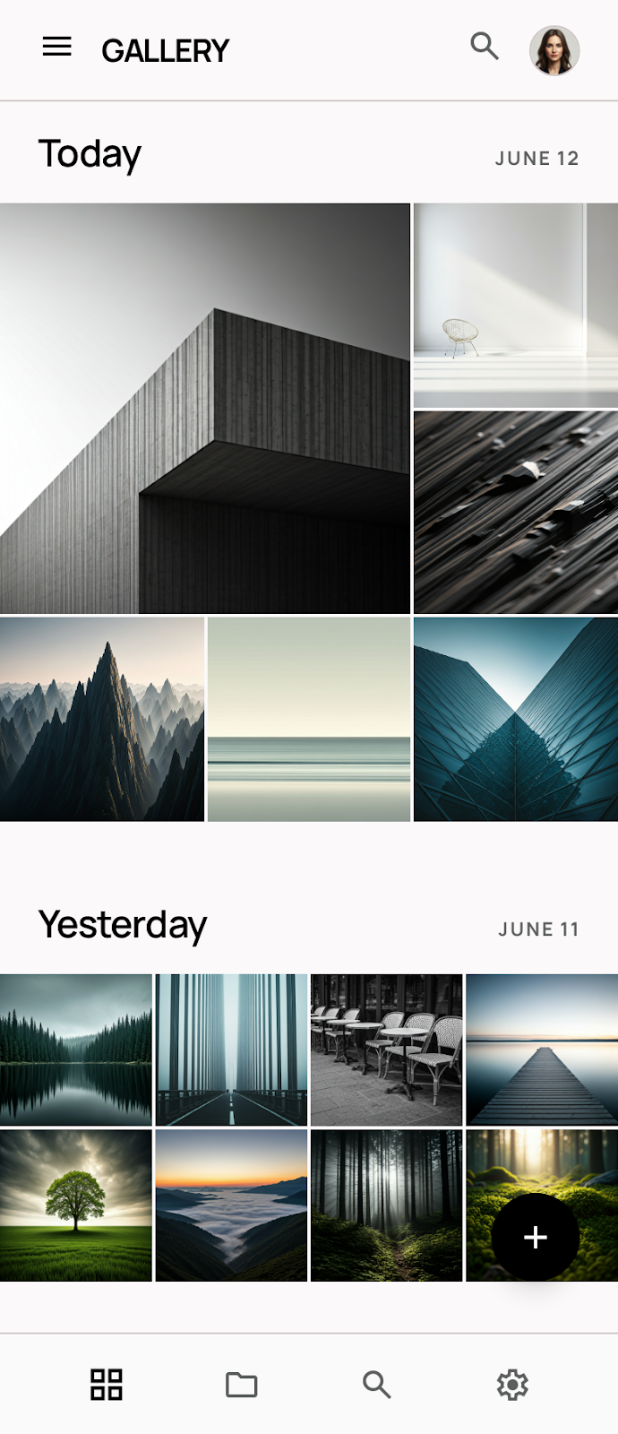
The design system is anchored in a Minimalist philosophy, functioning as a silent frame for the user's visual content. The objective is to vanish the interface in favor of the imagery, creating a gallery-like experience that feels premium and focused.
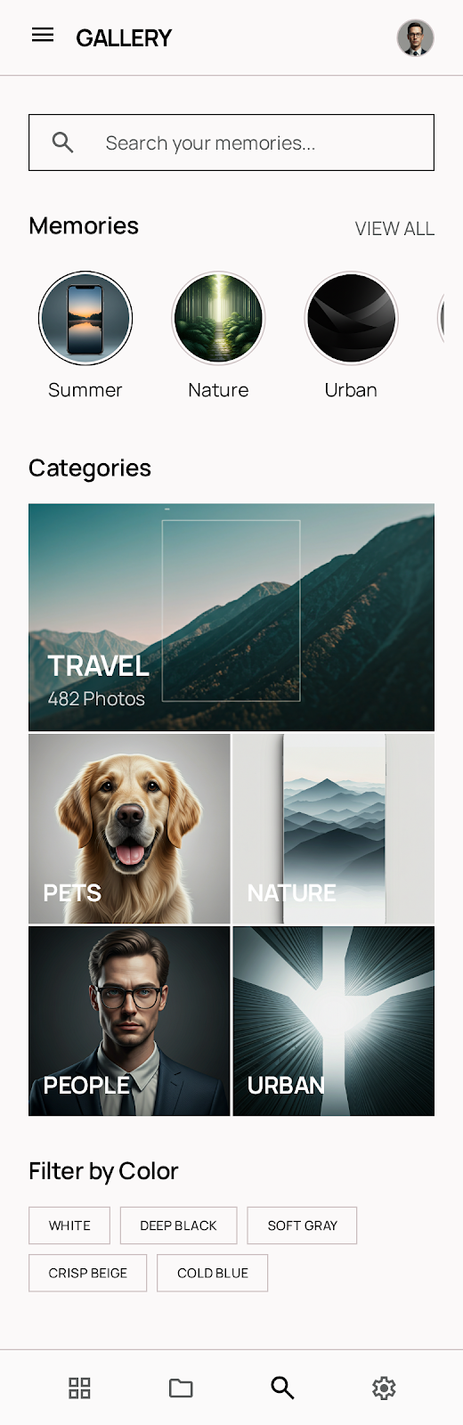
The brand personality is sophisticated and utilitarian. It targets creators and collectors who value clarity over decoration. By utilizing significant white space and a restricted color palette, the UI evokes a sense of calm and technical precision. The movement is contemporary, drawing from architectural modernism where form strictly follows the function of viewing.
Colors
The palette is strictly monochromatic to ensure zero color interference with photographs.
- Deep Black (#000000): Used for primary actions, high-contrast text, and heavy structural strokes.
- Pure White (#FFFFFF): The primary background surface, providing the ultimate "blank canvas" feel.
- Light Gray (#F2F2F2): Utilized for secondary surfaces, subtle dividers, and inactive states.
- Medium Gray (#757575): Reserved for metadata and less critical informational text.
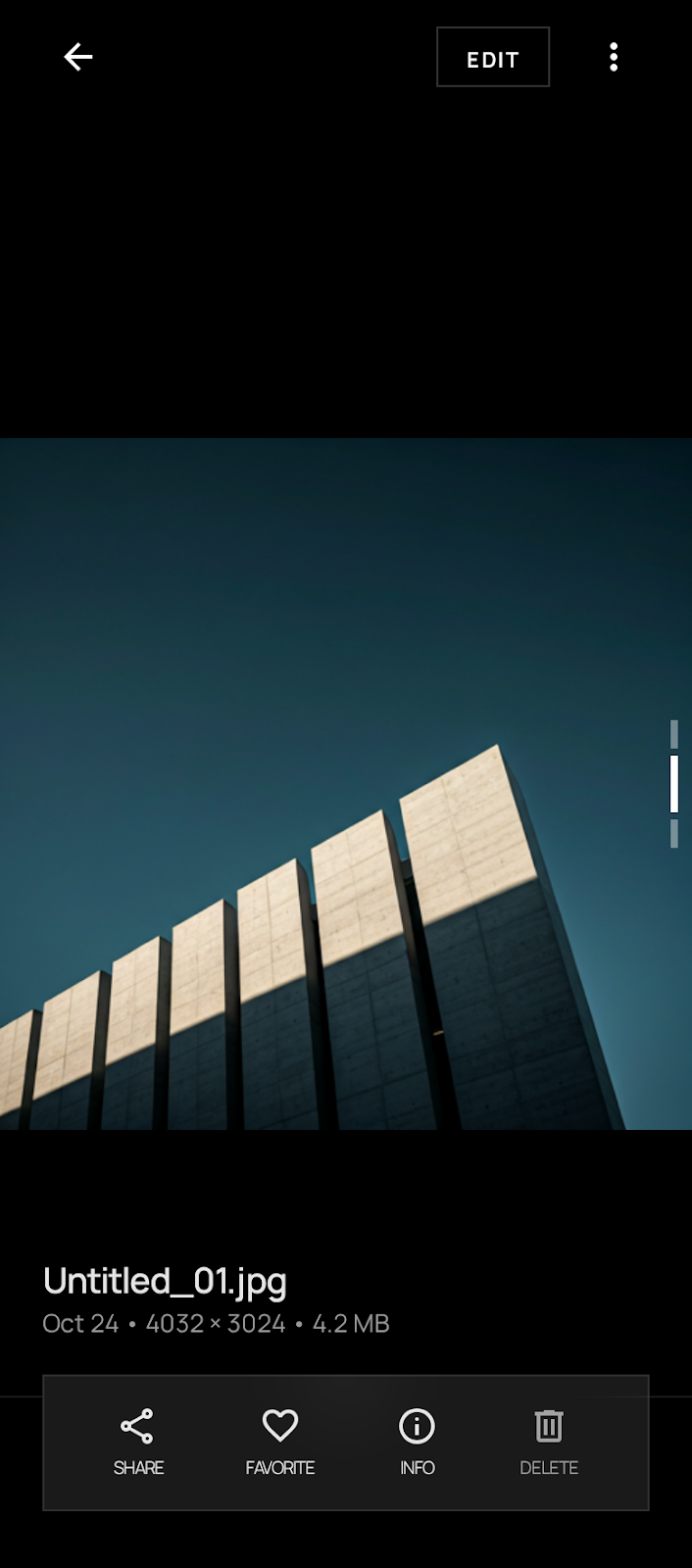
In "Immersive Mode," the interface should transition to a true-black environment to maximize the dynamic range of the mobile display and allow the photography to glow.
Typography
This design system utilizes Manrope for its technical yet approachable geometric qualities. The type hierarchy is intentionally flat to prevent the UI from becoming "loud."
- Headlines: Use a tighter letter-spacing and heavier weights to provide structural anchors on the page.
- Body: Standardized at 16px for optimal legibility against high-contrast backgrounds.
- Labels: Small caps with generous letter-spacing are used for metadata (e.g., ISO, aperture, date) to give the app a professional, archival feel.
- Alignment: Primarily left-aligned to maintain a strong vertical axis, echoing the edges of image frames.
Layout & Spacing
The layout philosophy is Edge-to-Edge Fluidity.
- The Grid: While a standard 12-column grid is used for text-heavy settings, the gallery view utilizes a high-density "No-Margin" grid for content discovery.
- Gutters: Photo thumbnails are separated by a minimal 2px gutter to create a monolithic wall of imagery.
- Safe Areas: Navigation and system bars use a 24px side margin to ensure touch targets are clear of the screen edges.
- Photography Priority: Full-screen views must bypass all margins and padding, occupying 100% of the viewport. UI overlays (like back buttons) should float with a backdrop blur or simple scrim.
Elevation & Depth
This design system avoids traditional shadows to maintain its minimalist aesthetic. Instead, it uses Tonal Layers and Low-Contrast Outlines.
- Surfaces: Depth is communicated by color shifts from White (#FFFFFF) to Light Gray (#F2F2F2).
- Outlines: When a container is required (like a search bar or chip), a 1px solid stroke in Light Gray is used rather than a shadow.
- Overlays: For modals or floating menus, a subtle 10% black tint is applied to the background to focus attention on the foreground layer without adding visual "fuzziness" from blurs or heavy shadows.
- Interaction: A slight scale-down (98%) on press is the primary method for indicating tactile feedback, rather than an elevation lift.
Shapes
The shape language is Sharp (0).
To reinforce the professional gallery aesthetic, every element—from image containers to buttons—uses 90-degree corners. This creates a rigorous, architectural structure that complements the rectangular nature of photography. Circular elements are strictly reserved for profile avatars or specific status indicators to provide a clear visual exception to the rule.
Components
- Buttons: Primary buttons are solid Deep Black with White text. Secondary buttons are 1px Deep Black outlines with no fill. All buttons are rectangular with no corner radius.
- Icons: Use ultra-thin (1pt or 0.5pt) strokes. Avoid filled icons unless indicating an active state (e.g., a "favorited" heart).
- Chips: Rectangular boxes with 1px Light Gray borders. Text is set in
label-sm.
- Inputs: Simple bottom-border (1px Deep Black) or a full rectangular outline. No background fill.
- Cards: For editorial content, cards use the full width of the screen. No shadows; the image occupies the top portion, followed by a tight 16px padding for the text area below.
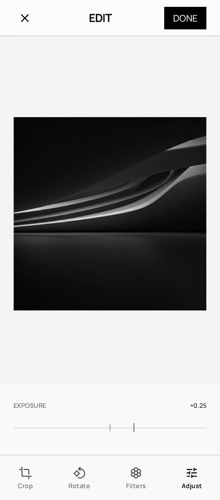
- The "Lightroom" Slider: A custom component for metadata browsing or photo editing, using a single-pixel horizontal line and a small vertical tick for the thumb.
- Lists: Separated by 1px Light Gray dividers that do not span the full width (inset by the margin-edge of 24px).